Nokia business cards/website
- Jun 12, 2015
- 1 min read
My Role: Lead Visual Designer | Client: Nokia USA
Streamlining the brand portfolio
Nokia is very proud of its Finnish heritage. Fusing Nokia traditions with technological innovation, I wanted to create Nokia's new feel and color palette. "Nokianess" is the message that we want to send out, inspired by a simple, natural and friendly family of products.
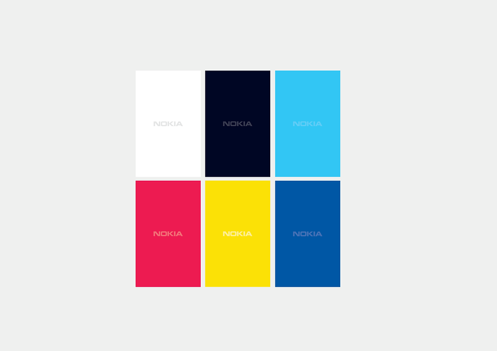
Colors
I wanted this rebranding to compel the company's rich and strong history.
Connect with the vendor/printer to finalized the paper, print production are extremely important.
Website
Ordering website for the business card, Nokia office are everywhere in the world. This website will allow employees to order their cards around the world.
Vertical
Horizontal

Nokia brand / New look and feel.

Without office address / with office address

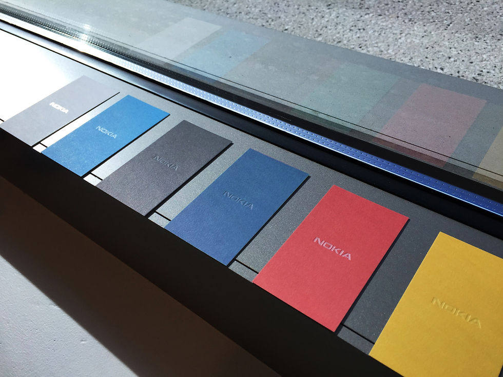
Nokia deboss logo

Nokia Technologies Only-6 colors


Nokia Network Only-3 colors


Ordering website


Comments